oeuth
Of all tools for data visualization, I mostly enjoy working with Vega-Lite. As I enhance my skills in making the visualizations using it, I become increasingly interesting not just in the “dataviz” part of its capabilities, but also on making it aesthetically compelling, as well as challenging myself to reach the limits of what is possible with Vega-Lite. I am by no means near the limits so far, however I got increasingly interested in replicating the charts I see throughout the internet.
One that caught me attention is Tableau’s Viz of the Day: Seven Bar Charts to Visualise Year-Over-Year Growth
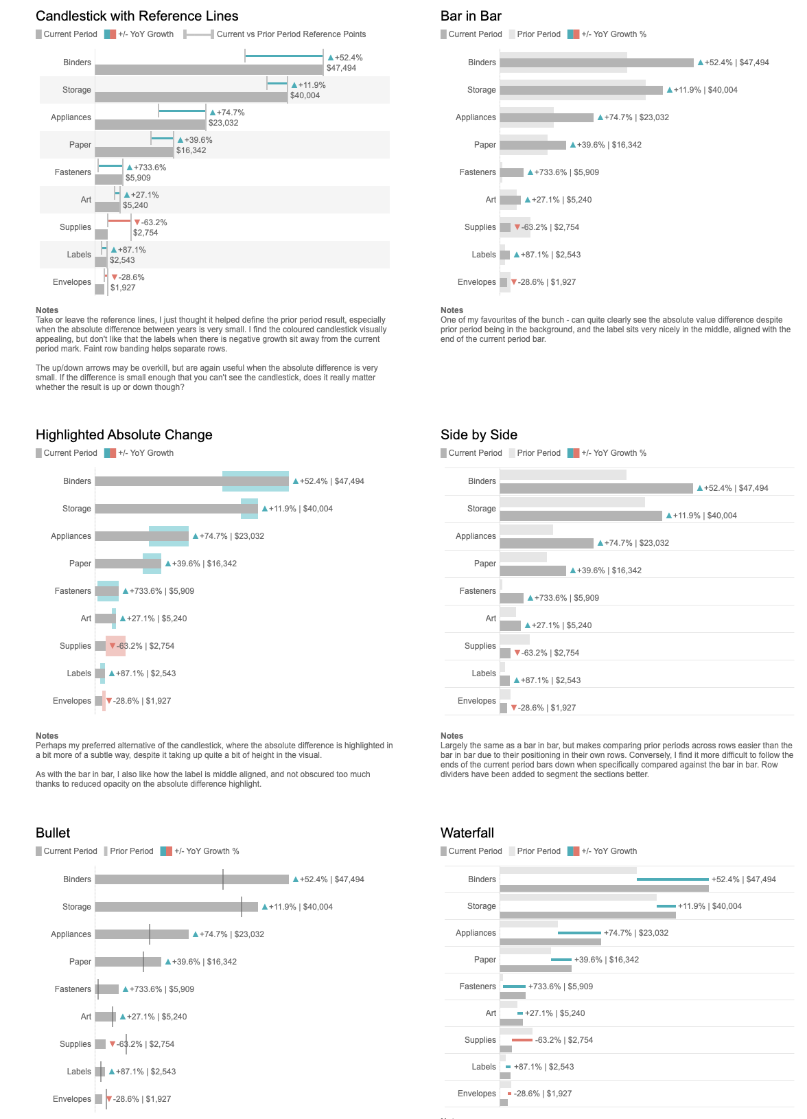
Here is what my attempt to replicate the charts in vega-lite looks like (each chart can be viewed in vega-editor via burger menu on the right top):
Initial Dataset
| Category | Current | Previous |
|---|---|---|
| Appliances | 22962.174 | 13183.887 |
| Art | 5122.616 | 4004.32 |
| Binders | 47133.138 | 29871.657 |
| Envelopes | 1926.632 | 2698.966 |
| Fasteners | 604.648 | 667.028 |
| Labels | 2416.994 | 1276.072 |
| Paper | 15947.488 | 11683.83 |
| Storage | 39407.746 | 35680.368 |
| Supplies | 2727.558 | 7482.186 |
Bar-in-bar
This one looks like it’s the most straightofrward one. Still, before moving forward, we need to perform several transformations that would allow us to calculate percentages and neatly show them as text:
  {"transform": [
    {
      "calculate": "toNumber(datum.Current)",
      "as": "cur_value"
    },
    {
      "calculate": "toNumber(datum.Previous)",
      "as": "prev_value"
    },
    {
      "calculate": "(datum.cur_value - datum.prev_value) / datum.prev_value",
      "as": "difference"
    },
    {
      "calculate": "datum.difference > 0",
      "as": "is_positive"
    },
    {
      "calculate": "max(datum.cur_value, datum.prev_value)",
      "as": "max_value"
    },
    {
      "calculate": "format(datum.difference, '+.0%') + ' | ' + format(datum.cur_value, '$,.0f')",
      "as": "text_label"
    }
  ]}
After this, we can make the following layers:
- Wider
barmark with previous value “background” - Thinner
barmark with actual numbers textmark with calculatedtext_label- two separate
pointmark layers, each with a different color but more importantly -triangle-upandtriangle-down. We cannot encode the two marks dynamically (or, rather, we cannot make dynamic fill color which is my goal here) so we’ll need to do it separately for positive and negative changes.
Highlighted Absolute Change
This one largely repeats the bar-in-bar, with the exception that the highlighted changes are achieved by combining x and x2 channels combined with color
Bullet
Key difference in schema here - instead of highlighted bar mark, we use tick with exact value for the previous period.